Difference between revisions of "SED plots introduction"
m |
|||
| (14 intermediate revisions by the same user not shown) | |||
| Line 6: | Line 6: | ||
Things that are warm emit light, including you. You are glowing in the infrared, and the spectrum of your emission looks like the blackbody curve above. [http://amazing-space.stsci.edu/resources/explorations/light/heating2-main.html Play "toast the robot"] to explore how the emissions change as a function of temperature. | Things that are warm emit light, including you. You are glowing in the infrared, and the spectrum of your emission looks like the blackbody curve above. [http://amazing-space.stsci.edu/resources/explorations/light/heating2-main.html Play "toast the robot"] to explore how the emissions change as a function of temperature. | ||
| + | |||
| + | Another good resource: http://phet.colorado.edu/en/simulation/blackbody-spectrum PhET (Physics Education Team) at CU Boulder produces educational science and engineering simulators geared towards various levels (K-college). This is one for blackbody spectra that some NITARP teachers' students found helpful. Most of these have lessons teachers uploaded. Those done by Kathy Perkins and Trish Loblein are really worth looking at. Kathy is the director of PhET; Trish is an educator working on a team to develop NGSS based lessons that utilize the sims. | ||
=SEDs in astronomy= | =SEDs in astronomy= | ||
| Line 31: | Line 33: | ||
[[file:gridbb_noav_lines.pdf]] is a pdf file with many sample, simple SEDs. These are plain blackbodies, corresponding to a grid of temperatures for a set of main sequence stars, all at the same distance. If you set up your pdf viewer to view one whole page at a time, you can scroll through them rapidly to see a "movie" of how the SED changes as the temperature of the star changes. ([http://www.youtube.com/watch?v=mjfSy2kHWqQ here is a YouTube version].) (Real stars aren't blackbodies, but they are close.) I've also added to these plots dotted lines at several specific filter locations. Watch how the shape of the SED changes at any given band. Watch how the brightness changes (even though these "test objects" are all at the same distance). If you stare at these long enough, you can understand how the colors of the objects change as a function of temperature, and thus where the objects appear in [[Color-Magnitude_and_Color-Color_plots |color-color and color-magnitude diagrams]]. | [[file:gridbb_noav_lines.pdf]] is a pdf file with many sample, simple SEDs. These are plain blackbodies, corresponding to a grid of temperatures for a set of main sequence stars, all at the same distance. If you set up your pdf viewer to view one whole page at a time, you can scroll through them rapidly to see a "movie" of how the SED changes as the temperature of the star changes. ([http://www.youtube.com/watch?v=mjfSy2kHWqQ here is a YouTube version].) (Real stars aren't blackbodies, but they are close.) I've also added to these plots dotted lines at several specific filter locations. Watch how the shape of the SED changes at any given band. Watch how the brightness changes (even though these "test objects" are all at the same distance). If you stare at these long enough, you can understand how the colors of the objects change as a function of temperature, and thus where the objects appear in [[Color-Magnitude_and_Color-Color_plots |color-color and color-magnitude diagrams]]. | ||
| − | = | + | |
| − | + | =The Next Steps= | |
| − | + | ||
| − | * | + | [[file:sedswithholes.jpg|left]] In the context of [[Studying Young Stars]], we are looking for stars that still have stuff around them left from the (still uncompleted) star formation process. On that page ([[Studying Young Stars]]), it has several schematic SEDs included partway down the page. [http://www.spitzer.caltech.edu/images/1179-ssc2004-08c-Spectra-Show-Protoplanetary-Disc-Structures This press release], from which the image on the left was taken, also shows schematic SEDs, though admittedly in the graphic here, it is labeled "brightness" rather than "energy" as a function of wavelength -- you get the idea, though the distinction is real and one should not be sloppy about such things. |
| + | |||
| + | In the graphic on the left, the top SED is that from a plain, unadorned star. The middle SED is from a large, substantial disk around the star. The last SED is what you (probably) get if you have a large inner disk hole, e.g., there is dust, but only at large radii from the star. Pulling in the information from [[Studying Young Stars]], you could infer (and people do) that the top object here is oldest, the middle object is youngest, and the bottom object is in between them in age, and possibly forming planets. | ||
| + | |||
| + | The difference between the SED that you observe around a young star with a dusty disk, and that which you might expect from an unadorned star (photosphere), is an "infrared excess" -- e.g., it is redder in the infrared than you expect it to be, if it did not have a disk. Another way of putting this (in a more SED-centric way) is that it has more energy coming out at long wavelengths than you expect from a plain star. You can express an IR excess in units of energy if you want to, but most people express it in terms of a difference in magnitudes, or a flux ratio. (Of course, a difference in magnitudes IS a flux ratio [see [[Units#Magnitudes|this page]] and [[Color-Magnitude and Color-Color plots|this page]] ], but I mean quite explicitly as a flux ratio, as in F(24)/F(RJ) is xx, or yy times the measurement error on the F(24) measurement.) | ||
| + | |||
| + | For completeness, let me mention that: | ||
| + | *--You can also get an infrared excess from an old star with a circumstellar dust disk (certain B stars are rotating so fast that they literally throw off their own matter into a circumstellar disk, and certain giant stars are so big that they form dust in the outer layers of their atmosphere, creating an IR excess there too). | ||
| + | *--You can get an ultraviolet excess (more UV than you expect from a plain star) from active accretion from the disk onto the star. For more information on that, see [[Finding cluster members]]. | ||
Latest revision as of 17:05, 31 July 2020
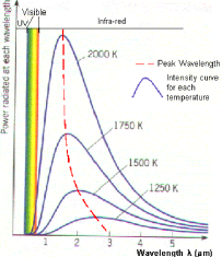
A spectral energy distribution (SED) is a graph of the energy emitted by an object as a function of different wavelengths. The graph at the right is a typical curve, called a blackbody curve. It shows that the amount of energy emitted by the object at all wavelengths varies with the temperature of the object. Hotter objects emit more light at shorter wavelengths than cooler objects; therefore the hotter the object, the more the peak wavelength is shifted toward the left of the graph.
Stars aren’t really blackbodies but the emission from them is very similar to blackbodies. We can "fit" a blackbody curve to the star. Any emission from dust around the stars will then be really obvious because it will show up as "extra" emission (but at a much lower temperature than the star) because the dust is being warmed up by the star. Sometimes this emission can be fit by another much cooler blackbody.
Contents
Thermal emission
Things that are warm emit light, including you. You are glowing in the infrared, and the spectrum of your emission looks like the blackbody curve above. Play "toast the robot" to explore how the emissions change as a function of temperature.
Another good resource: http://phet.colorado.edu/en/simulation/blackbody-spectrum PhET (Physics Education Team) at CU Boulder produces educational science and engineering simulators geared towards various levels (K-college). This is one for blackbody spectra that some NITARP teachers' students found helpful. Most of these have lessons teachers uploaded. Those done by Kathy Perkins and Trish Loblein are really worth looking at. Kathy is the director of PhET; Trish is an educator working on a team to develop NGSS based lessons that utilize the sims.
SEDs in astronomy
By plotting up the energy emitted by an astronomical object, we can compare at a glance the emissions across a broad range of wavelengths. Does most of the energy come out in the UV or in the IR? The answer to that question can tell us something about what the object is.
The page on studying young stars has examples of SEDs for, you guessed it, young stars.
Units matter!
Technically, an SED, by definition, is a plot of energy as a function of wavelength. Some people also use the term SED to apply to plot of flux or flux density as a function of wavelength, although technically, this is just a spectrum, not a spectral energy distribution. ( Read more about units here.)
Photometry or spectroscopy?
When you put points on an SED, are you doing photometry or spectroscopy? Well, let's think about that.
When you measure the flux from an object in, say, IRAC channel 1, you are measuring the total flux emitted by the object over a bandpass that is not infinitely thin. It has a distinct width, pretty much centered on 3.6 um (3.6 um is actually a weighted average, weighted by the transmission function of the filter). When you measure the flux of an object at the 4 IRAC bands, you are in effect measuring a VERY low resolution spectrum, one with only 4 points. When you measure the flux of an object with IRS, on the other hand, you take a spectrum, but that means you get a lot of points over the wavelength range corresponding to the module you use (and the number of points corresponds to the resolution). Data from IRAC, MIPS, and IRS, and any other instrument from any other telescope, can be portrayed on an SED. In both photometry and spectroscopy, you are measuring flux at a certain wavelength (or range of wavelengths). Then you can convert it to energy density [as a function of wavelength] and add it to the SED.
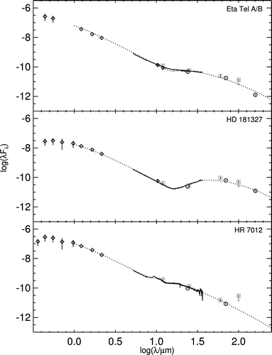
In the image at left, which comes from this paper, there are SEDs for three stars with debris disks. The measured photometric points at non-Spitzer bands are diamonds (with the error bars portrayed vertically), the measured photometric points at Spitzer bands are circles (again with error bars, often too small to see), the historical IRAS photometric points are grey squares (often with downward-pointing arrows to denote upper limits), the solid black line are the IRS spectroscopic points (error most apparent near the red edge in the lower panel), and the dotted line is the model discussed in the paper.
Note that both photometry and spectroscopy are valid and real parts of this SED.
Things to try and think about
File:Gridbb noav lines.pdf is a pdf file with many sample, simple SEDs. These are plain blackbodies, corresponding to a grid of temperatures for a set of main sequence stars, all at the same distance. If you set up your pdf viewer to view one whole page at a time, you can scroll through them rapidly to see a "movie" of how the SED changes as the temperature of the star changes. (here is a YouTube version.) (Real stars aren't blackbodies, but they are close.) I've also added to these plots dotted lines at several specific filter locations. Watch how the shape of the SED changes at any given band. Watch how the brightness changes (even though these "test objects" are all at the same distance). If you stare at these long enough, you can understand how the colors of the objects change as a function of temperature, and thus where the objects appear in color-color and color-magnitude diagrams.
The Next Steps
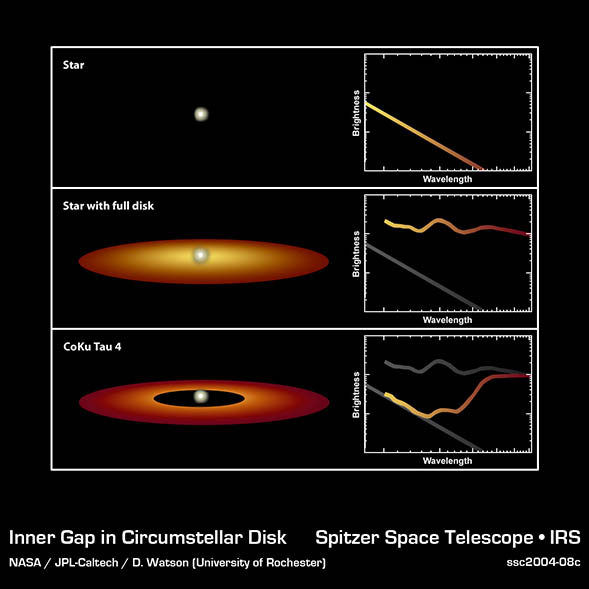
In the context of Studying Young Stars, we are looking for stars that still have stuff around them left from the (still uncompleted) star formation process. On that page (Studying Young Stars), it has several schematic SEDs included partway down the page. This press release, from which the image on the left was taken, also shows schematic SEDs, though admittedly in the graphic here, it is labeled "brightness" rather than "energy" as a function of wavelength -- you get the idea, though the distinction is real and one should not be sloppy about such things.
In the graphic on the left, the top SED is that from a plain, unadorned star. The middle SED is from a large, substantial disk around the star. The last SED is what you (probably) get if you have a large inner disk hole, e.g., there is dust, but only at large radii from the star. Pulling in the information from Studying Young Stars, you could infer (and people do) that the top object here is oldest, the middle object is youngest, and the bottom object is in between them in age, and possibly forming planets.
The difference between the SED that you observe around a young star with a dusty disk, and that which you might expect from an unadorned star (photosphere), is an "infrared excess" -- e.g., it is redder in the infrared than you expect it to be, if it did not have a disk. Another way of putting this (in a more SED-centric way) is that it has more energy coming out at long wavelengths than you expect from a plain star. You can express an IR excess in units of energy if you want to, but most people express it in terms of a difference in magnitudes, or a flux ratio. (Of course, a difference in magnitudes IS a flux ratio [see this page and this page ], but I mean quite explicitly as a flux ratio, as in F(24)/F(RJ) is xx, or yy times the measurement error on the F(24) measurement.)
For completeness, let me mention that:
- --You can also get an infrared excess from an old star with a circumstellar dust disk (certain B stars are rotating so fast that they literally throw off their own matter into a circumstellar disk, and certain giant stars are so big that they form dust in the outer layers of their atmosphere, creating an IR excess there too).
- --You can get an ultraviolet excess (more UV than you expect from a plain star) from active accretion from the disk onto the star. For more information on that, see Finding cluster members.


