Difference between revisions of "Color-Magnitude and Color-Color plots Overview"
| Line 42: | Line 42: | ||
Near- and mid-infrared measurements (such as those taken with Spitzer) can be combined with optical data or used on their own to make CC diagrams. | Near- and mid-infrared measurements (such as those taken with Spitzer) can be combined with optical data or used on their own to make CC diagrams. | ||
| − | Color-color plots can be used to separate objects of different types, such as distinguishing galaxies from stars. | + | Color-color plots can be used to separate objects of different types, such as distinguishing galaxies from stars. The plot on the right comes from Fig.2 from Fan et al. 2001, AJ, 122, 2833, and was used to show how the quasars (lower right) are different than brown dwarfs (top) and more boring objects (cluster of points). |
| + | |||
| + | [[Image:cmdqsos.png|right]] | ||
Revision as of 22:36, 12 April 2007
Color-Magnitude Diagrams
The original version of this text copied from this site
There is a relationship between the luminosity & surface temperature based upon
- the initial mass of a star
- its age
- its composition (usually a small effect)
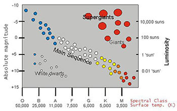
The initial studies of the relation between the absolute magnitudes (equivalent to luminosities) and spectral types (broadly equivalent to temperature) were performed (independently) by Ejnar Hertzsprung (Danish, 1905) and Henry Norris Russell (USA, 1913). Thus the plots of luminosity vs. temperature (or absolute magnitudes vs. spectral types) are often referred to as Hertzsprung-Russell (or HR) diagrams.
Stars of different initial masses follow different evolutionary paths within the luminosity-temperature plane. However, stars spend most of their hydrogen-burning lives within a relatively narrow band within the luminosity-temperature plane known as the Main Sequence. You can use this fact to get relative ages for clusters based on the shape of the main sequence ("main sequence fitting").
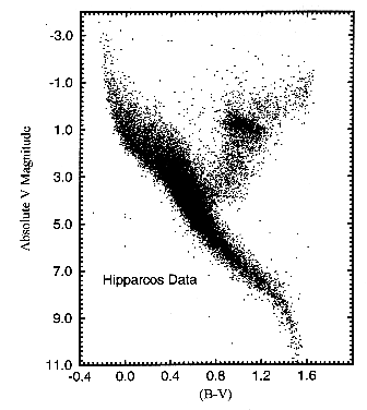
However, instead of plotting stars directly on the actual luminosity-temperature plane, an equivalent plot, known as a color-magnitude (CM) diagram is often used instead (such as the figure on the right). The reasons are as follows:
To first order, the light emitted by a star is a black body. Thus, rather than actually measure & plot (in Kelvin) the temperature of every star, it is MUCH easier and quicker to simply measure & plot the ratio of the intensity of the star in two spectral bands. This ratio is then directly related to the black body function and hence temperature. For primarily historical reasons, the ratio is usually expressed as the difference (in magnitudes) between two standard (optical/IR) spectral bands and is known as the color. Traditionally, the most commonly used color is the difference between the B and V bands (centered at 440 & 550 nm, respectively) and usually written as simply B - V.
Similarly, rather than actually measure & plot (in W/m^2) the total flux of every star, it is MUCH easier to simply measure & plot the flux in a standard (optical/IR) spectral band. Again since the emitted spectra are black bodies, this is directly related to the total flux. Traditionally, the most commonly used band is the V band (550 nm) and usually written as simply V.
Hence, typically CM diagrams are used rather than HR diagrams. For example
- if the distances to all the stars have been determined, then this might be a plot of B - V versus absolute V band magnitude.
- if the distances to all the stars have NOT been determined (say for a star cluster), then this might be a plot of B - V versus apparent V band magnitude.
These are both equivalent to plots of luminosity vs. temperature.
Near- and mid-infrared measurements (such as those taken with Spitzer) can be combined with optical data or used on their own to make CMDs.
Other Web Resources
- http://www.astro.washington.edu/labs/clearinghouse/labs/Clusterhr/cluster.html
- http://orca.phys.uvic.ca/astrocourses/a120/A120/lab5.html
Color-Color Diagrams
In order to compare CM diagrams of two different clusters at two different distances, you need to know the distance to each cluster in order to calculate the absolute magnitude from the apparent magnitude. But what if you don't know the distances to the clusters? Wouldn't it be nice to still be able to learn something about the clusters, even if you don't know the distances? (Because distances are hard to get!)
The magnitude of a star is related to the log of the flux. Therefore, a color (or the difference of two magnitudes) is related to the ratio of the fluxes. When you take the ratio of the fluxes, the distance cancels out. Colors are independent of distances! So a color-color plot is also independent of distance.
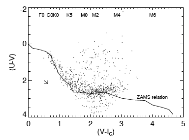
By studying main-sequence clusters, we can determine the locations of "normal" stars (or other objects) in nearly any color-color space. Then, stars (or other objects) that have colors different than these normal objects stand out. For example, in the plot on the left, the relationship between these two colors (U-V and V-I) for normal stars is indicated by the line marked "ZAMS Relation." Normal stars are clumped along this line. Stars significantly above this line are brighter than expected in U-V given their observed color in V-I. This plot was used in Rebull et al. (2000) to argue that those stars, those that are brighter than expected in U-V, are likely cluster members.
Near- and mid-infrared measurements (such as those taken with Spitzer) can be combined with optical data or used on their own to make CC diagrams.
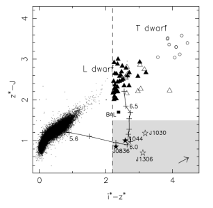
Color-color plots can be used to separate objects of different types, such as distinguishing galaxies from stars. The plot on the right comes from Fig.2 from Fan et al. 2001, AJ, 122, 2833, and was used to show how the quasars (lower right) are different than brown dwarfs (top) and more boring objects (cluster of points).


