SED plots introduction
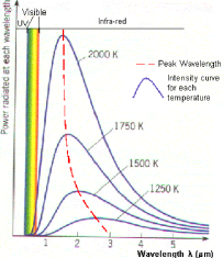
A spectral energy distribution (SED) is a graph of the energy emitted by an object as a function of different wavelengths. The graph at the right is a typical curve, called a blackbody curve. It shows that the amount of energy emitted by the object at all wavelengths varies with the temperature of the object. Hotter objects emit more light at shorter wavelengths than cooler objects; therefore the hotter the object, the more the peak wavelength is shifted toward the left of the graph.
Stars aren’t really blackbodies but the emission from them is very similar to blackbodies. We can "fit" a blackbody curve to the star. Any emission from dust around the stars will then be really obvious because it will show up as "extra" emission (but at a much lower temperature than the star) because the dust is being warmed up by the star. Sometimes this emission can be fit by another much cooler blackbody.
Thermal emission
Things that are warm emit light, including you. You are glowing in the infrared, and the spectrum of your emission looks like the blackbody curve above. Play "toast the robot" to explore how the emissions change as a function of temperature.
SEDs in astronomy
By plotting up the energy emitted by an astronomical object, we can compare at a glance the emissions across a broad range of wavelengths. Does most of the energy come out in the UV or in the IR? The answer to that question can tell us something about what the object is.
The page on studying young stars has examples of SEDs.
Units matter!
Technically, an SED, by definition, is a plot of energy as a function of wavelength. Some people also use the term SED to apply to plot of flux or flux density as a function of wavelength, although technically, this is just a spectrum, not a spectral energy distribution. ( Read more about units here.)
Photometry or spectroscopy?
When you put points on an SED, are you doing photometry or spectroscopy? Well, let's think about that.
When you measure the flux from an object in, say, IRAC channel 1, you are measuring the total flux emitted by the object over a bandpass that is not infinitely thin. It has a distinct width, pretty much centered on 3.6 um (3.6 um is actually a weighted average, weighted by the transmission function of the filter). When you measure the flux of an object at the 4 IRAC bands, you are in effect measuring a VERY low resolution spectrum, one with only 4 points. When you measure the flux of an object with IRS, on the other hand, you take a spectrum, but that means you get a lot of points over the wavelength range corresponding to the module you use (and the number of points corresponds to the resolution). Data from IRAC, MIPS, IRS, and any other instrument from any other telescope, can be portrayed on an SED. In both photometry and spectroscopy, you are measuring flux at a certain wavelength, then you can convert it to energy as a function of wavelength and plot it on the SED.
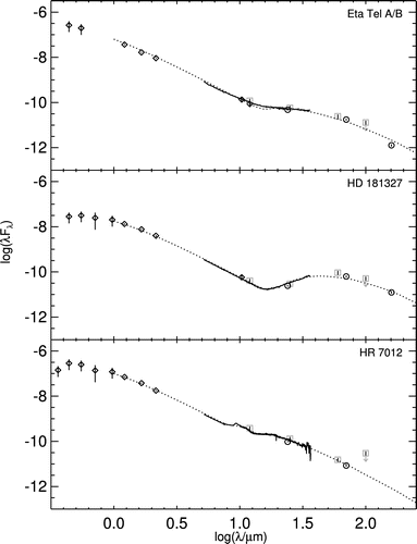
In the image at left, which comes from this paper), there are SEDs for three stars with debris disks. The measured photometric points at non-Spitzer bands are diamonds (with the error bars portrayed vertically), the measured photometric points at Spitzer bands are circles (again with error bars, often too small to see), the historical IRAS photometric points are grey squares (often with downward-pointing arrows to denote upper limits), the solid black line is the IRS spectroscopic points (error most apparent near the red edge in the lower panel), and the dotted line is the model discussed in the paper.
Note that both photometry and spectroscopy are valid and real parts of this SED.

